 |
I have some old, very large panels that need to be "used up". So, I fell back on my preferred stand-by on this 40x60 inch panel: non-representational abstract imagery. Oh, that's just plain FUN! I think that I will glaze some on this piece, simply to create a sense of depth on the picture plane.     
Here's an old piece that I revisited, selecting an image suggested in the abstraction and turning it into a ballerina on stage, complete with stage lights.
Here are some pics of early progress on my generic male figure for 3D-Ecorche class.
         Here is an example of what I'm doing in landscape painting (a scene from Queeny Park in West County St. Louis). Just the second level of under-painting. Oh, I had to glaze white over almost everything to convey "fog", and darken the pond. The heavy stuff goes on next week (really!).   And I've started a second landscape, this one from a photo of the bluffs at Castlewood State Park. And I've started a second landscape, this one from a photo of the bluffs at Castlewood State Park. |
Showing posts with label Back to College!. Show all posts
Showing posts with label Back to College!. Show all posts
Monday, January 16, 2017
Spring Semester Production
Hopefully, this post will grow like the previous. Except, I will try to limit the step-by-step development of pieces and focus on finished pieces (so much for that attempt!)
Thursday, December 29, 2016
Christmas Break
Not very exciting, but it's something that I've needed to do for many years: color charts!

This is all about matching with a color and knowing how to "make it".

These are just two chart examples...I'm putting together 8 sheets for 12 hues. Each chart starts with the straight hue, then mixed with white to fill out a six point scale. Then it's mixed with all of the other hues on my 12 color palette. Each one of those is then reduced in value on the same scale.
 In the next 10 days, I am planning on squeezing in a newfresco self portrait with color conscious glazing which will take advantage of this color study.
Here's where I've had to call it quits with the "hand/model" painting. Just got to move on (I wasn't able to recover from having to reseal the ground).

And I started another self portrait using that new tile sub-flooring material. This shows the very beginning stage of drawing with the squirted plaster line on the sized surface.
 My process involves sanding down the squirted drawing bead, filling specific areas with plaster (often premixed with tempera paint), painting over textured areas with black tempera paint to create a fine tracery/contour line, and then more layers of the same.
 Further development: premix filling of particular areas, with combing
texture lines that follow cross-structural contours, and a sprinkling of
fabric dye for added visual texture.
Further development: premix filling of particular areas, with combing
texture lines that follow cross-structural contours, and a sprinkling of
fabric dye for added visual texture.
 Even though classes have begun for the Spring semester, I will continue to post photos of progress with regard to this painting/newfresco. As the layers increase, the image will become more obscure.


This is all about matching with a color and knowing how to "make it".

These are just two chart examples...I'm putting together 8 sheets for 12 hues. Each chart starts with the straight hue, then mixed with white to fill out a six point scale. Then it's mixed with all of the other hues on my 12 color palette. Each one of those is then reduced in value on the same scale.
 In the next 10 days, I am planning on squeezing in a newfresco self portrait with color conscious glazing which will take advantage of this color study.
Here's where I've had to call it quits with the "hand/model" painting. Just got to move on (I wasn't able to recover from having to reseal the ground).

And I started another self portrait using that new tile sub-flooring material. This shows the very beginning stage of drawing with the squirted plaster line on the sized surface.
 My process involves sanding down the squirted drawing bead, filling specific areas with plaster (often premixed with tempera paint), painting over textured areas with black tempera paint to create a fine tracery/contour line, and then more layers of the same.
 Further development: premix filling of particular areas, with combing
texture lines that follow cross-structural contours, and a sprinkling of
fabric dye for added visual texture.
Further development: premix filling of particular areas, with combing
texture lines that follow cross-structural contours, and a sprinkling of
fabric dye for added visual texture. Even though classes have begun for the Spring semester, I will continue to post photos of progress with regard to this painting/newfresco. As the layers increase, the image will become more obscure.
Everything has been layered and filled at this point. Now, I've got to sand it down and seal the surface. Then I can glaze with some Golden acrylic pigment and matte medium, where needed.
 |
Image revealed through sanding
|
 |
| Image enhanced through sealing |
Saturday, December 10, 2016
Metals Class
Here are pics of some of what I did in the Metals Course (Jewelry).
 This is a detail of three medallions, rolling ring, and broom cast tie clasp.

 |
| My favorite was this Shell Box made from 20g copper, brazed, topped with a shell handle (cuttlefish bone casting set with prong rivets), and finished with an ammonia/salt patina. |
 |
| A copper Snow Flake medallion with a tube set zirconium diamond and ammonia fume patina. |
 |
| 80% of the production. |
 |
| A last look at the shell box closed and with a poly-coat to protect the patina. |
Wednesday, November 2, 2016
New Paintings
 |
| Simple still life with a plane-linear color patch approach. |
 |
| This was another still life study where the objects had to be white and identified with subtle hues within the white. |
 |
 |
Even though glazing in the tradition of the Renaissance
artists is not my preferred method/style, the Alex Folla workshop
did inspire me to go back to that time honored technique and apply it to a
portrait. This piece has a lighter brown under-painting and is obviously in
process: a few more layers of glazing to go (Titian's approach). As far as I'm concerned, this is
an easier way to paint than compared to direct painting.


Yeah, another modification. I had to redo her skin entirely. Lost the purity of the facial features as a result. But, with some more tweaking, I should be able to get the skin tone right and restore the features.
On the other hand (ha, ha!), had success with my hand. Pretty daring with the lime green background (I'll wait for comments from my crit group on that).
Here's the final for my painting class. Four panel landscape with a twist. I used two images from a video clip from my world bicycle tour: a ride along the Rhine River Radweg. I'm saving the hardest part for last...the figures.

The work in this class has taken me back to the basics and helping me to sharpen my skills.
Wednesday, October 19, 2016
First Three Completed

In this unusual self portrait, I defined the figure and broke up the "frame" around the image by extending content through to the edge. I also darkened some areas, especially in the upper background, to create greater contrast and drama. I found that in order to restore the white of the fish skeleton, I had to grind it out with a dremel and decided to keep some of it open to give a greater sense of dimension.
 I incorporated the figure into this piece: images taken from old family photos of relatives from my Armenian side. The fact that the partial self-portrait on the lower right happens to look angry is purely incidental. I also enhanced some of the color and lowered the value scale at some key points.
Friday, September 9, 2016
Three Weeks of Studio Production
Here are three pieces that I've been working on since having been issued a studio space in the Strassner off-campus building.
 |
| "Back to Fish 2" This is a remake of a piece I did several years ago (a favorite which was accidentally destroyed). I've got to make some adjustments on the left arm and do much more glazing. |
 |
| "Celestial Tree" This abstract composition just received its first layer of glazing and will have a few "ghost-like" images, from very old family photos, drawn/sketched in various places, and in varying scale, on the picture plane. |
 | |||
| "Graham" This portrait, of the brother of a former student of mine, is in the first stages of development: initial squirted plaster line, added texture, black paint over texture to create a fine ridge-line delineation, after future sanding. |
Wednesday, August 17, 2016
Course #2: Chinese Ink Drawing and Watercolor
The following images are some of the results from the second Summer session I took at Fontbonne. Very beneficial experience. I learned how to REALLY draw/paint bamboo!


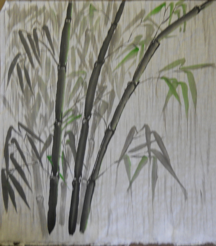 |
| Bamboo in the rain |
 |
| A story about a deadly hawk hidden in beauty and an unsuspecting field mouse, as prey. |
 |
| Inspired from another image of a nuthatch on pine branch. |
 |
| Basic orchid with "almond eye" leaves. |
 |
| The "fourth gentleman" is Lotus. This quick study includes a partially obscured koi. |
 |
| Magpie on bamboo, with my signature/stamp. |
Subscribe to:
Posts (Atom)